BLOOM

Packaging

Outlaw x Spirit Brief

Outlaw Intern Project

“Where creativity blooms”

Develop a packaging design for an “Outlaw” premium spirit that shows off who we are and what we do. Tell our story, whether it is based on our personality, location, ethos or the studio space itself.

Consider all aspects of the design: including the type of alcohol that complements your idea best, the packaging connection to our existing brand, and the bottle structure / any impactful finishes.

Solution:
Rustic Industrial Studio meets Beautiful Botanical Gardens.

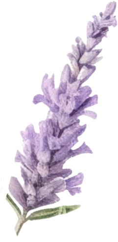
A premium gin inspired by the rare botanical wildlife found in the Avon Gorge (a nod to Outlaw’s Bristolian roots), whilst reflecting their beautifully rustic studio space, previously a derelict distillery.

Thermochromic ink printing allows delicate botanical illustrations to appear when the gin is chilled, acting as a visual metaphor for Outlaw’s blooming creativity.

Different font styles symbolise the wealth of creativity found in the studio.

The majority of BLOOM gins in production will display delicate flowers when chilled, but a select few will display weird and wonderful mixes of illustration. Are you a true Outlaw? Chill the gin to find out.

ALL BOTTLES
ROOM TEMPERATURE

MAJORITY OF BOTTLES WHEN CHILLED

THE “TRUE OUTLAW” BOTTLES WHEN CHILLED

The flowers for the “ordinary gin” were carefully chosen to reflect the rare species found in Bristol’s Avon Gorge, whilst also depicting the flavour of the gin.

Autumn Squill

Proctor’s Rowan

Bristol Rock-Cress

Elderflower

The label (a small envelope) is made of seed paper, intended to be planted once the bottle has been finished. Inside, it contains a random selection of seeds that you can gift to a friend. Share and sow the seeds of creativity, and watch them bloom…

Note: A copper wire holds the envelope to the bottle - copper wire is used during gardening to create support against fences and trellises. The copper is also a nod to the materials used during the gin distillation process and the placement of it is to Outlaw’s prominent strikethrough.

The “BLOOM” typography consisted of various font styles to represent the vibrancy and wealth of creativity found at Outlaw. This included a letter from the Bristol-based type artist, Jamie Clarke. To not distract from the hero illustration, elegant and minimalistic letters were used.

The box is housed in an outer pull-out pack secured with a ribbon, a nod to the crossbar on the ‘O’ in Outlaw’s logo; with a die-cut frosted window that alludes to the idea of keeping the gin in the fridge. The inner packaging holding the bottle is fully biodegradable within 45 days, and can be mixed with the seeds in soil to aid their growth.

The below are alternative bottle variations that were not chosen. Too bold and meaningful, they distracted from the hero illustration instead of supporting it. The bold colours contradicted the light and clarity of the initial concept, however the brick texture was carried forward in a more subtle fashion in the resulting design.

The signature of the studio can be found on the metallic band along the neck of bottle. Subtle and embossed, it leaves a tangible reminder of the small but mighty studio, that is Outlaw.

Poster sets use a similar printing technique, allowing flowers to flourish in direct sunlight.

Next
Next

MOTHER